Do you ever walk into a room and feel an immediate sense of calm or excitement based solely on the colors used in the design? It can make or break the overall aesthetic and mood of a room. In this blog post, we share tips and tricks for creating a stunning and cohesive color palette for your next interior design project.
Sometimes we can get caught up in the excitement of bright and bold colors, but oftentimes less is more. A simpler color palette can actually be more impactful and effective.
Why use a simple color palette?
By limiting your choices to just a few colors, you create a cohesive look that is easy on the eyes. It’s less overwhelming for viewers and allows them to focus on the important aspects of your design or project. Plus, with fewer colors to choose from, it makes decision-making easier and quicker.
You won’t have to worry about it going out of style or becoming outdated quickly. And if you ever need to update your design, it’s much easier to do so when working with a smaller selection of colors.
So next time you’re faced with the task of choosing a color palette, consider keeping it simple. Your audience will thank you for it!
Benefits of a simpler color palette
A simpler color palette can make a big difference! By using fewer colors, you can create a more cohesive and streamlined look. This means that everything looks like it belongs together.
Plus, when you use fewer colors, it’s easier to make decisions about what looks good. You don’t have to worry as much about clashing or making things too busy. And let’s face it – sometimes having too many choices just makes things harder!
Simpler color palettes also tend to be more timeless. While trendy colors may come and go, classic hues like black, white, and gray will always be in style. This means that your designs won’t feel dated after a few years.
Overall, choosing a simpler color palette can help you create better designs that stand the test of time. So next time you’re creating something new, consider simplifying your color choices for a cleaner and more effective result.
Creating a color palette
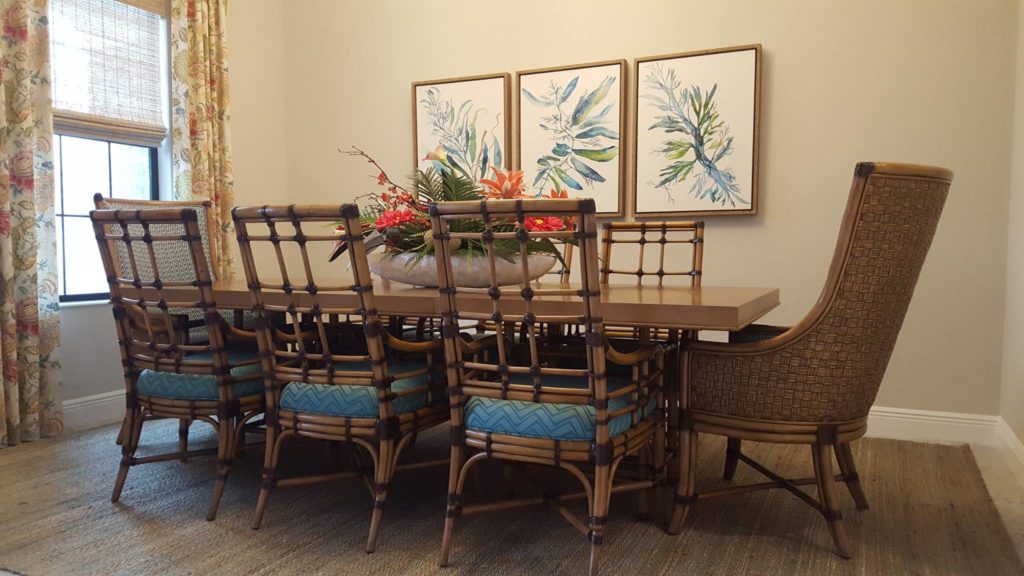
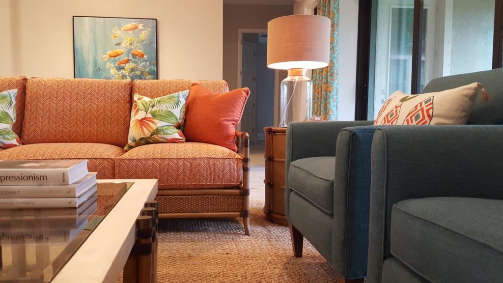
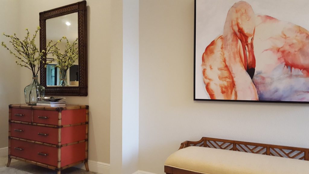
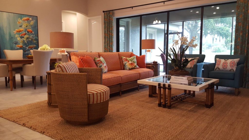
Creating a color palette for interior design is an exciting and creative process. It involves selecting colors that will bring warmth, personality and style to your space. To begin, consider the keywords provided to guide you in choosing the right hues.
For instance, if the keyword is “vibrant,” think of colors like reds, oranges or yellows. If it’s “serene”, opt for muted tones such as blues, greens, and soft grays. Other terms such as “trendy” might lead you towards bold and daring colors while “elegant” could suggest muted metallics like golds, silvers and coppers.
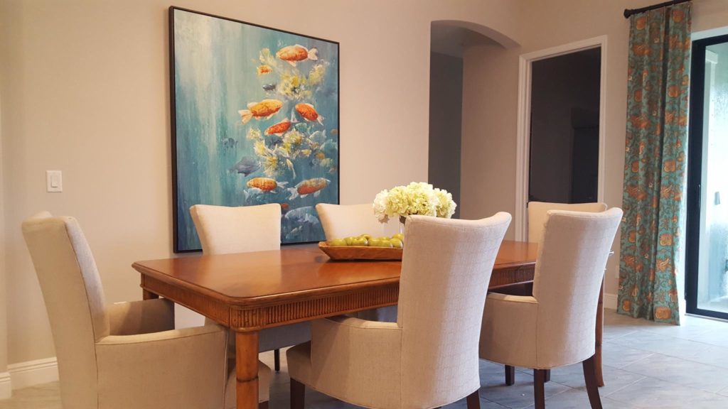
When picking out your color scheme, make sure they complement each other and don’t clash. Neutral shades such as white, beige, black or gray are also important to include in your color palette. They can serve as a backdrop or allow your chosen colors to pop.
Remember that creating a color palette for interior design should reflect your personality and taste. Don’t be afraid to experiment and try new things – after all, it’s your space! By following these simple tips, you’ll have a beautiful and cohesive room that reflects your unique style.
In conclusion, choosing the right color palette for your interior design is key to creating a cohesive and inviting space. So, don’t be afraid to experiment with different shades and hues, and remember to keep things balanced and harmonious for a truly stunning result. Happy decorating!